
In the dynamic world of consumer goods, staying relevant is key to remain South Africa’s most loved peanut butter. For a household name like Black Cat Peanut Butter, synonymous with quality and taste, a rebrand isn’t just a cosmetic make over; it’s a strategic move to solidify its position in the hearts and minds of consumers. Berge Farrell had the privilege to spearhead this monumental rebranding effort, for our long-time client, Tiger Brands.
The journey began with a visionary investment by Tiger Brands, injecting R300 million into a state-of-the-art manufacturing facility in Chamdor, Krugersdorp. This bold move set the stage for a transformative chapter in Black Cat’s history. With the infrastructure in place, the spotlight turned to the brand’s identity, signalling a pivotal moment for innovation and reinvention.

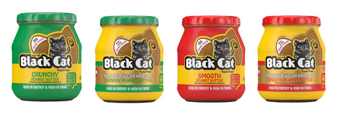
Tasked with the challenge of differentiating two tiers of products while maintaining brand equity, Berge Farrell embarked on a journey of strategic analysis and creative exploration, on a mission to redefine the brand for the modern consumer landscape.
The core objective was clear: elevate Black Cat by amplifying quality and health credentials to justify its value proposition. The design team crafted packaging that exudes sophistication while retaining the brand’s essence. Bold, uncomplicated designs communicate value, while clear colour blocks evoke a sense of grounded authenticity.
Drawing inspiration from the brand’s heritage, the team incorporated elements like the Black Cat Pawprint, tapping into the emotional resonance of strength and resilience. This subtle nod to inner empowerment resonates with a younger audience, reinforcing Black Cat’s relevance in an ever-evolving market.
The result? Two routes that seamlessly blend tradition with innovation. An evolutionary approach, utilising the Cat head silhouette, distinguishes each tier, with transparent elements inviting consumers to engage with the product. Vibrant colours inject a fresh energy, appealing to a new generation of peanut butter enthusiasts.
But the rebranding goes beyond aesthetics; it’s a testament to Black Cat’s commitment to its core values. With a focus on sustained energy and natural ingredients, Black Cat embodies the spirit of resilience and determination. It’s not just about peanut butter; it’s about fuelling everyday achievements and celebrating the journey to self-improvement.
In the world of design, principles like contrast, balance, and unity serve as guiding lights. Our meticulous attention to these principles shines through in every aspect of Black Cat’s new look. From the playful personality to the strategic use of white and non-printed space, every detail is a testament to the brand’s evolution.
As Black Cat Peanut Butter unveils its bold new identity, it reaffirms its place as a beacon of quality and taste. This rebranding triumph is not just a makeover – it’s a statement of intent. Black Cat is not just a brand; it’s a symbol of empowerment, resilience, and the relentless pursuit of excellence. So, the next time you reach for a jar of Black Cat Peanut Butter, remember – it’s more than just a spread; it’s a testament to the power of reinvention.