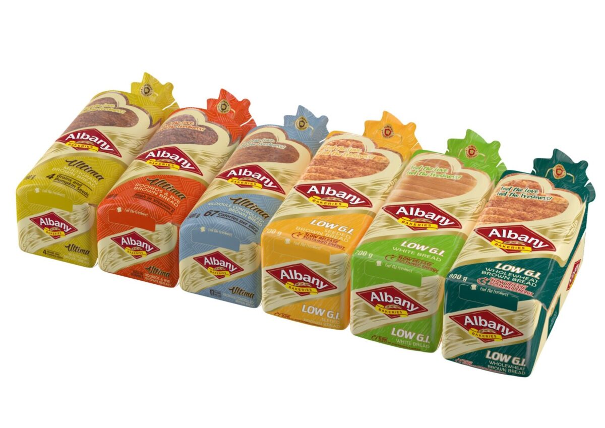
There are a multitude of brand and marketing channels that a Consumer Packaged Goods / Fast Moving Consumer Goods (CPG / FMCG) brand can and will utilise in its effort to gain awareness, increase sales, and build brand love that leads to repeat purchases into the future.
The mind quickly moves to thinking about the often-used channels such as the more traditional – TVC, radio, OOH – and digital (social media, paid ads, websites etc). Multiple channels – either owned, paid and earned – that are available for brands to build sustainable consumer connections and loyalty, likely to be used as a collective for maximum effect.
The one thing that is common amongst all of these channels is that the “hero” of these for a CPG / FMCG brand is the product; it is what will be the highlight and focal point of any TikTok video, any print ad, or any TVC.
Furthermore, we can also debate that the actual physical product, besides any variations in colour, shape, taste or smell (the latter two cannot be experienced in-person via an advertisement), is fairly generic, unremarkable, and mostly indistinguishable from a competitor. Some popular examples here include liquids (alcoholic, non-alcoholic, beverages, milk etc), creams (skincare etc), baked goods (bread, pastries etc) and foods (vegetables, fruits etc).
The list is long, but the point is, if actual physical competitor products were lined up next to each other, they are highly unlikely on their own to sway a consumer to switch if they already have something similar, and more likely, cause confusion and apathy, which of course would be bad for the category as a whole.
So what then is the “true hero” for a CPG / FMCG product? What sets it apart extrinsically from all of its competitors in what are becoming largely very commoditised and homogenous categories?
Full marks if you guessed the packaging. Bonus marks if you followed it up with “Hmm, with this in mind I really don’t think I utilise this channel enough in my brand and marketing repertoire”.
Your products packaging is not only an opportunity to visually show differentiation and to highlight intrinsic and functional benefits but it’s also the best chance to tell your brands story firsthand such that customers and consumers will choose you over the others. We talk about its strategic value more in depth here.
It is likely the first, and most consistently seen, touch point that your target customer will get to experience your brand, whether this is on the retail shelf or online via any marketing channel. It is also an owned brand channel, one which besides marginal one-off design and production costs, incurs no further ongoing or pay-per-click costs the more it is interacted with or seen.
So why do brands continually overlook and under-utilise their packaging design? After all, the surface area of your packaging is a blank billboard to communicate directly to your ideal customer, to be used to gain competitive advantage as often and however you wish.
To be clear, this is not a call to rebrand every few months (which is another topic altogether). Rather, it’s about the realisation that an existing brand architecture and packaging hierarchy can be complimented frequently with for example, special edition communication and packaging that highlight key consumer occasions (such as Easter, Christmas, Black Friday), key brand occasions (collaborations, anniversaries etc) and during any and all brand campaign and activation periods.
Packaging should not be relegated to the “set-and-forget” and “grudge investment” categories. Rather, it should frequently be front-and-centre when considering any brand and marketing investment because it is the centre piece of your brand. It is the lighthouse for consumers when they are navigating to your brand, either for the first time, or the next time.
***Berge Farrell APAC is an independent global brand design agency. With over two decades of working with CPG / FMCG brands, we have a deep strategic and tactical understanding of the market***

12 Responses